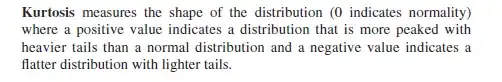
In a book (SAS Essentials: A Guide to Mastering SAS for Research 2009 page 143) it says:
However, when I look at this picture (not from the book, from the web):
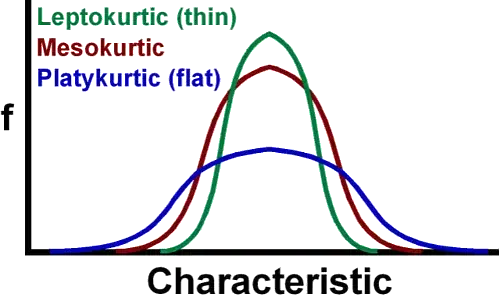
Or also this picture, in case the first one is maybe wrong (also from the web):

So the leptokurtic (thin) green curve has a Kurtosis which is positive, it is more peaked. Ok, clear to me. But what about the tails? When I look at the right and the left tail, the red mesokurtic curve has heavier tails? I mean there is clearly more area under the curve under the red curve than under the green curve?