3

I'm comparing two groups of students by their course activity and I'm struggling a little to determine the best way to test for significant difference.

The data is non-normal, and very prevalent with zeros, so it doesn't work well with many of the more common tests.

I've tried Mood's median but the median most often ends up being zero because of the prevalence of that number. Is this OK?

If not, can anyone recommend a test which would be suitable for comparing the two rows of data above?

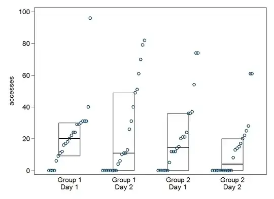
EDIT: Here is some sample data - apologies for not including copy/pastable numbers originally. I'm comparing activity on a daily basis, so Group 1 Day 1 vs Group 2 Day 1. And then comparing each day in the 5 days of the course. Each number logged within the groups records the number of times an individual student has accessed learning materials within a course. So, each number shows how 'involved' a particular student has been within a course. Each number is an individual student on that particular day. Group 1 and Group 2 have separate samples of students, but the course is the same, barring one small difference in delivery style.

Group 1 Day 1
17  29  24  40  31  96  24  31  31  30  0   0   18  16  0   0   9   12  20  29  11  6   22

Group 2 Day 1
20  24  12  74  36  54  21  74  37  21  5   12  15  0   0   0   14  0   0   0   12  36  

Group 1 Day 2
82  49  11  11  79  0   31  0   61  13  0   26  51  4   6   70  40  10  0   0   0   0   0

Group 2 Day 2
28  25  0   61  14  13  0   17  0   0   61  0   22  0   0   0   0   15  8   20  0   0   
Tavrock
  • 1,552
  • 8
  • 27
Colin Gray
  • 41
  • 2
  • 4
    What are the numbers measuring exactly? (And tests can be non-parametric but data can't!) – Scortchi - Reinstate Monica Mar 03 '15 at 10:02
  • 3
    "Compare" and even "look for significant difference" are very broad objectives. Between exactly what and why? I can imagine problems for which ignoring zeros was exactly right and problems where it is quite wrong. If you explain what concerns you scientifically/practically, there should be a way of advising on procedure. Data, by the way, are not "non-parametric"; some methods have been described as such. – Nick Cox Mar 03 '15 at 10:05
  • Sorry folks, to explain more - the image shows two rows in which each cell records the number of times a student has accessed learning materials within a course. So, each cell shows how 'involved' a particular student has been within a course. Each cell is an individual student on a particular day. Row 1 is the first group of students, on one particular course, and row 2 a second different group of students, on a similar course, but with one difference that I want to compare. – Colin Gray Mar 03 '15 at 10:19
  • 1
    So count data - a bar or spike plot for each group would be a good start. (And please edit the post to include extra info. rather than leaving it in comments.) – Scortchi - Reinstate Monica Mar 03 '15 at 10:43
  • 1
    As a teacher I am interested in such matters, but I would probably look at the number (count and fraction) of zeros and the means and medians of the non-zeros. No need to choose just one summary measure; no obvious reason to seek a significance test. The ideal example data allows copy and paste so that people are able to give you sample calculations, but almost no active member will type in numbers from an image. – Nick Cox Mar 03 '15 at 10:46
  • Apologies Nick, I'll include some copyable data if that's the normal approach - just learning :) – Colin Gray Mar 04 '15 at 12:50
  • The reason I'm looking at significance tests is that I'm hoping to publish this data as part of a new approach to teaching online courses, so I'd like to be able to prove that the improvement is large enough that it's not likely to be present by chance. Is that not something that's relevant when comparing two simple sets of numbers? – Colin Gray Mar 04 '15 at 12:52
  • 3
    "Prove" really is the wrong word here and implies a rhetoric that isn't good for anything. Part of the answer may just lie in the style of the journals in which you intend to publish. It's all too likely that they fetishize significance tests. But substantively, suppose groups differ or days differ. You still have to find a way to make that seem interesting or important. As a dopey example, Mondays might be different. I have the opposite bias, to start with graphs and simple summaries, and then see if you need anything else. – Nick Cox Mar 04 '15 at 13:10
  • And thanks for the pointer Scortchi - I've put together some histograms comparing my day 1 to day 5. It does seem to show that one group is more weighted to the higher end than the other. – Colin Gray Mar 04 '15 at 13:24
  • That's interesting, thanks Nick. I've done just that by accident, slightly though lack of having anything weightier just now. I've put together a commentary of the patterns based just on simple graphs and it seems to hold together quite well. Your comment on fetishizing significance tests is what's scaring me though - I feel I need something to indicate how reliable the comparison is. – Colin Gray Mar 04 '15 at 13:26
  • 1
    @Scortchi (re: "parametric data") I found one of the culprits, and it's a huge one: [*AP Biology Quantitative Skills: A Guide for Teachers* (The College Board, NY, NY. 2012)](http://media.collegeboard.com/digitalServices/pdf/ap/AP_Bio_Quantitative_Skills_Guide-2ndPrinting_lkd.pdf). "If enough measurements are made, the data can show an approximate normal distribution, or bell-shaped distribution, on a histogram; if they do, they are parametric data." (At p. 33.) "The data distribution may be skewed or have large or small outliers (nonparametric data)." (At p. 35.) – whuber Apr 03 '15 at 16:52
  • (Continued) I can't help adding this follow-on quotation (at p. 35), because it's hilarious in its flagrant inconsistency: "Generally, the parameters calculated for nonparametric statistics include medians, modes, and quartiles ... ." – whuber Apr 03 '15 at 16:54
  • 2
    @whuber Correct me if I'm wrong, but my understanding [I'm British] is that AP means Advanced Placement and such courses are for strong students in U.S. high schools. So, a translation for non-U.S. readers is that a group likely to become scientific researchers later in life is being fed confused statistical nonsense at an early age! – Nick Cox Apr 07 '15 at 10:39
  • 2
    @whuber: It's not just an oversight, either: on p7 "The data collected to answer questions generated by students will generally fall into three categories: (1) normal or parametric data, (2) nonparametric data, and (3) frequency or count data." – Scortchi - Reinstate Monica Apr 07 '15 at 10:55
  • @Nick That's right. I have also heard comments from professors who advise on the AP *statistics* exam which suggest there is no communication between these two disciplines: what you are *supposed* to "know" for the AP bio exam is *explicitly wrong* for the AP stats exam! (A case in point is the misguided subjective Bayes-like interpretation of confidence intervals for the bio exam.) – whuber Apr 07 '15 at 14:23

1 Answers1

5

Here is a token visualization. I am partly drawing on my own experiences (prejudices, if you prefer) as a teacher, mainly but not exclusively at university level. It often seems that the fine structure of different kinds of students, or of different student attitudes and behaviours, is much more interesting and important than trying to test group differences through means or medians.

Any way, if these dataset sizes are typical, you can keep quite faithful to the detail in the data.

enter image description here

The graph shows a quantile plot for each subset, i.e. the quantiles are just the values ordered from smallest to largest and plotted against a tacit cumulative probability scale. On that is superimposed the now conventional boxes for medians and quartiles, with an understandable but predictable awkwardness that the lower quartile will be zero if a quarter or more of the students have zero accesses. (In principle, that could also happen to the median and upper quartile if the fractions of zeros were large enough.)

The graph has a small merit of being explicit about repeated zeros. Other simple but important features are occasional really keen (or confused?) students, drop-off from Day 1 to Day 2, etc. Hybridising quantile and box plots in this way I learned from papers by Emmanuel Parzen. Box plots themselves I regard as widely oversold, as they so often omit key detail in the tails of the distribution. (For those interested, the graph was drawn in Stata using my own stripplot command, which is downloadable from SSC.)

As suggested earlier, splitting into zeros and non-zeros and looking at means and medians for the latter only is a possibility.

I am keener on cutting back on your significance testing than on suggesting extra significance tests for you.

Nick Cox
  • 48,377
  • 8
  • 110
  • 156