Macond's answer is accurate, however from the original post, I thought it might be helpful to simplify the verbiage a bit.
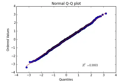
A Q-Q plot stands for a "quantile-quantile plot".
It is a plot where the axes are purposely transformed in order to make a normal (or Gaussian) distribution appear in a straight line. In other words, a perfectly normal distribution would exactly follow a line with slope = 1 and intercept = 0.
Therefore, if the plot does not appear to be - roughly - a straight line, then the underlying distribution is not normal. If it bends up, then there are more "high flyer" values than expected, for instance. (The link provides more examples.)
- What do the x & y labels represent?
The theoretical quantiles are placed along the x-axis. That is, the x-axis is not your data, it is simply an expectation of where your data should have been, if it were normal.
The actual data is plotted along the y-axis.
The values are the standard deviations from the mean. So, 0 is the mean of the data, 1 is 1 standard deviation above, etc. This means, for instance, that 68.27% of all your data should be between -1 & 1, if you have a normal distribution.
- What does the $R^2$ value mean?
The $R^2$ value is not particularly useful for this sort of plot. $R^2$ is typically used to determine whether one variable is dependent upon another. Well, you are comparing a theoretical value to an actual value. So there will necessarily be some sort of $R^2$. (E.g., even a random uniform distribution will have a moderately decent $R^2$.)
Lastly, there is a similar plot that is rarely used called the p-p plot. This plot is more useful if you are interested in focusing upon where the bulk of the data lies, instead of the extremes.