I am having difficulties to select the right way to visualize data. Let's say we have bookstores that sells books, and every book has at least one category.
For a bookstore, if we count all the categories of books, we acquire a histogram that shows the number of books that falls into a specific category for that bookstore.
I want to visualize the bookstore behavior, I want to see if they favor a category over other categories. I don't want to see if they are favoring sci-fi all together, but I want to see if they are treating every category equally or not.
I have ~1M bookstores.
I have thought of 4 methods:
Sample the data, show only 500 bookstore's histograms. Show them in 5 separate pages using 10x10 grid. Example of a 4x4 grid:
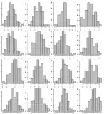
Same as #1. But this time sort x axis values according to their count desc, so if there is a favoring it will be seen easily.
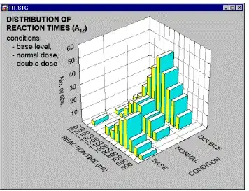
Imagine putting the histograms in #2 together like a deck and showing them in 3D. Something like this:
Instead of using third axis suing color to represent colors, so using a heatmap (2D histogram):
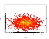
If generally bookstores prefer some categories to others it will be displayed as a nice gradient from left to right.
Do you have any other visualization ideas/tools to represent multiple histograms?