I am trying to figure out a way to graphically represent the following result. I have four variables, two DV and two IV. All variables are continuous. There are unique relationships between these pairs such that only DV1 has a positive correlation with IV1 and only DV2 has a positive correlation with IV2. Is there anyway I can make some type of graphic to represent this?
Asked
Active
Viewed 4,036 times
3
-
To clarify: are IV1 and IV2 independent? What about DV1 and DV2? If both are, why not just plot DV1 vs IV1 and DV2 vs IV2 separately? – Ben Kuhn Dec 06 '14 at 05:49
-
1Of course they are independent. The issue is trying to visually contrast the result that each dependent variable shares a positive relationship with only one independent variable - not the other independent variable. – brainman Dec 06 '14 at 07:05
-
3OK. I'm sure the more experienced folks on here will have better ideas, but a standard [scatterplot matrix](https://www.google.com/search?q=scatter+matrix&es_sm=91&tbm=isch&tbo=u&source=univ&sa=X&ei=DK6CVMvqJ4XuoASe0oKYCw&ved=0CCcQsAQ&biw=1277&bih=718) seems like a potentially reasonable approach. – Ben Kuhn Dec 06 '14 at 07:29
-
hmm you're right I could do it this way, but it is a bit 'messy'. Thanks for the suggestion, though! Hopefully someone knows of a way that I can do this with one single image. – brainman Dec 06 '14 at 18:13
-
why is a scatterplot matrix messy? is the data messy? – Dianne Cook Dec 07 '14 at 17:03
2 Answers
4
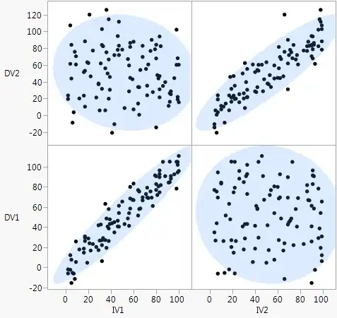
Though you said a scatterplot matrix was "messy" in the comments, here are a couple that with augmentations to show the relationship on the data. The augmentations summarize the relationships that might make the plot look less messy overall. If not, at least it's a chance for you to clarify the non-messy requirement.
The first shows correlation with an ellipse and the second shows regression with a fitted line. Of course, you can get rid of the data points all together to simplify, but the summarizing elements are more convincing when you can see the data, too. However, if you have tons of points or more than a few variables, but makes more sense to drop the individual data points from the graphs.
xan
- 8,708
- 26
- 39
-
-
-
1Great to hear. It's actually [JMP](http://www.jmp.com/) output, but any stats package can make similar plots. – xan Dec 09 '14 at 00:50