7

I have a data set shown as box-whisker graphs after disaggregating. See below.

enter image description here

I am wondering why Tableau (the product I am using) automatically plots a whole bunch of values outside the box-whisker. I thought the whiskers of the box are minimums and maximums. It says that the values above the maximum whisker are outliers but I don't see the need to show it and second not sure what logic it uses to calculate it. So just wondering whether anyone knows why someone would want to look at a box-whisker graph which has outliers shown as well rather than them being contained within the box-whisker? (I.e. is this common statistical practice?)

Nick Cox
  • 48,377
  • 8
  • 110
  • 156
Gil
  • 173
  • 1
  • 1
  • 4
  • 3
    I can't comment easily on Tableau, which I have never used -- but if its documentation doesn't explain its practices, then why take it seriously? But your last question has an easy answer. Showing data points individually if they are more than 1.5 IQR away from the nearer quartile is common (so far as I can judge, the most common single flavour of box plots). That is, show points higher than upper quartile + 1.5 IQR or lower than lower quartile - 1.5 IQR. Here IQR = upper quartile - lower quartile. At a guess, Tableau is here showing all data points plus a superimposed box for each group. – Nick Cox Nov 26 '14 at 02:29
  • 3
    Not the question, but your example data cry out to be shown on a transformed scale, notably a logarithmic scale if all values are positive. They are reminiscent of city population data. To return to your question: the extra data points show important detail that the boxes omit, so getting rid of it is the wrong direction to go. – Nick Cox Nov 26 '14 at 02:31
  • Many questions here on boxplots, as the existence of a tag does hint. – Nick Cox Nov 26 '14 at 02:31
  • 1
    You can right click on your affected axis and choose "Edit Reference Line" and set the whiskers to extend to the min/max of the dataset - this won't remove outliers, but the whiskers will no longer be extending to 1.5 X's the IQR -- instead, they'll extend to the min and max of the data being considered. –  Apr 17 '15 at 18:34

2 Answers2

8

The usual (and original) definition of a box and whisker plot does include outliers (indeed, Tukey had two kinds of outlying points, which these days are often not distinguished).

Specifically, the ends of the whiskers in the Tukey boxplot go at the nearest observations inside the inner fences, which are generally at the upper hinge + 1.5 H-spreads and lower hinge - 1.5 H-spreads (basically, UQ + 1.5 IQR and LQ - 1.5 IQR). What's outside those is marked as outliers.

That's what R does, for example:

boxplot of stopping distances

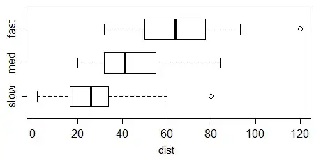
There are many variations on the box plot, and some packages implement other things than the Tukey boxplot, but it's the most common one. Indeed, Wickham & Stryjewski's "40 years of boxplots" mentions numerous variations (and that's only a fraction of what can be found out there).

See Wikipedia's article on the box plot for some basic details.

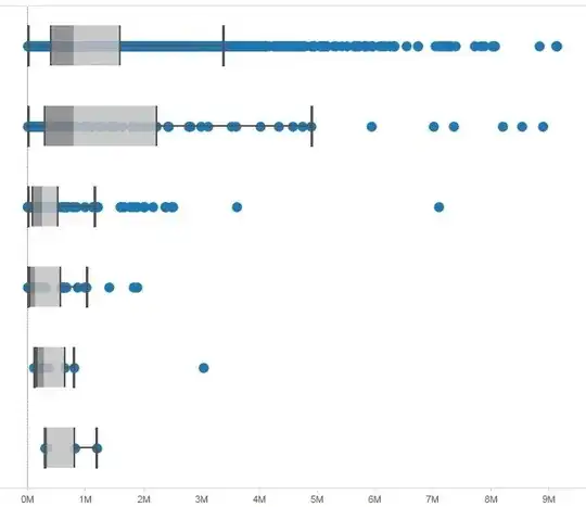
Incidentally, Tableau isn't just showing outliers - it's showing all the data there. You can see it's marking points between the ends of the whiskers, and even points inside the boxes, not just the ones outside the inner fences.

Tableau describes its boxplots here; as you see the description broadly matches what I describe for Tukey boxplots above.


Edit: This is just to add a drawing of what the boxplot elements look like in the Schmid and Crowe references mentioned in comments so people don't have to chase them down to see what was being discussed:

enter image description here

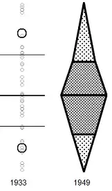
(the Crowe version is slightly tweaked here in a couple of ways, one of which makes it seem a bit more boxplot-like; I may do a more faithful version later)

Glen_b
  • 257,508
  • 32
  • 553
  • 939
  • 2
    The paper cited appears to have stalled given lukewarm reviews. https://github.com/hadley/boxplots-paper publicises what appear to be two reviews by _American Statistician_ reviewers and comments sent privately by David Hoaglin and myself. More crucially, the comments underline that the history is **much** longer than the 40 years of the title (which has been much cited on the internet). – Nick Cox Nov 26 '14 at 03:06
  • @NickCox I agree that 40 years is an underestimate -- indeed, I mentioned a reference to Hadley several years ago (an old book by Schmid, around 1949 if I remember correctly, which shows a clear precursor, rather like some of the variants in the paper) that is now mentioned (since some time in 2012) in a comment in the paper's tex file at github but doesn't yet seem to in the references. Nevertheless, it's about the best coverage of variants I can easily point to in one place. – Glen_b Nov 26 '14 at 03:38
  • @NickCox (Edited) -- It was Calvin F. Schmid *Handbook of Graphic Presentation*, 1954. Fig 114, p178 (see [here](https://archive.org/details/HandbookOfGraphicPresentation), noting that page numbers don't quite correspond to what's printed on the page); the graph is of quantiles (5-25-50-75-95) of new house prices vs (categories of) area in square feet, from a 1949 report. I've drawn what the boxes within the chart look like at the bottom of my answer above. – Glen_b Nov 26 '14 at 08:02
  • My review of the paper points to earlier work yet. It's accessible on github.com, so I won't repeat the references. – Nick Cox Nov 26 '14 at 08:57
  • @Nick Yes, I had already read your review earlier, thanks. – Glen_b Nov 26 '14 at 09:37
  • 3
    I support @Glen_b's lucid and concise presentation, which I upvoted, but I'd like to emphasise that the spirit of Tukey's rule for identifying which points should be plotted individually beyond the whiskers was that those data points needed thought and if need be action. Indeed in Tukey's work a box plot with a tail of such values was often the signal for a transformation. Sometimes the idea is encountered that 1.5 IQR etc. is the basis for a rule for identifying which points should be discarded, or regarded as dubious, which I think was a very long way indeed from Tukey's intent. – Nick Cox Nov 26 '14 at 09:48
  • I agree completely with @NickCox's characterization of Tukey's intent with the points that are now usually called outliers in the boxplot. It's well worth reading Tukey's own words on the matter. – Glen_b Nov 26 '14 at 10:09
  • @Nick I don't want to lead too far off topic, but I'm not sure if you've been on chat. Reading Bowley (1910), he does mention using min-10-25-50-75-90-max as a summary (a 7 number summary akin to Tukey's 5, on p62) and mentions a display (in a footnote there), but the display is effectively a CDF; for the moment the display from 1949 in Schmid is the oldest display I've actually laid eyes on so far that I'd really call a boxplot. I'd like to try to chase down some of the other references you mention. – Glen_b Nov 26 '14 at 10:18
  • Crowe in _Scottish Geographical Magazine_ 1933 ticks most boxes (pun intended). 1.5 IQR etc. was Tukey's main innovation. (Earlier he played with rules based on 1 IQR and 2 IQR.) – Nick Cox Nov 26 '14 at 11:56
  • @Nick Thanks, I have it now. Indeed that does tick most of the boxes. If he hadn't joined up the quartiles with vertical lines between the groups, I'd say it's *clearly* a variety of boxplot, but even with that, it's basically all there - a grouped 5 number summary (at least if you count the subsequent addition of the outer octiles as bold circles), lines for the three quartiles with median distinguished by a bold line. With a few minor cosmetic tweaks it makes quite a pleasing display. – Glen_b Nov 26 '14 at 22:21
  • @Nick The copy of the 1933 paper I have has no Figure 2, but from the text Figure 2 sounds like it's relevant (and slightly different from Fig 1). Do you know if it was omitted from the original? I wonder if it was perhaps placed elsewhere in the magazine or something. – Glen_b Nov 26 '14 at 23:11
  • 1
    Figure 2 seems to have been omitted from the on-line version. From my notes: His figure 2, a map of Europe with several climatic stations, shows monthly medians, quartiles, and octiles. Other references: Crowe, P.R. 1936. The rainfall regime of the Western Plains. _Geographical Review_ 26: 463-484. Matthews, H.A. 1936. A new view of some familiar Indian rainfalls. _Scottish Geographical Magazine_ 52: 84-97. Hogg, W.H. 1948. Rainfall dispersion diagrams: a discussion of their advantages and disadvantages. _Geography_ 33: 31-37. – Nick Cox Nov 27 '14 at 15:57
  • @Glen_b - If the ends in a Tukey box plot are UQ + 1.5 IQR and LQ - 1.5 IQR and since IQR is a constant (75th - 25th pct) then why aren't the whiskers equidistant from the LQ and UQ. In the plot by OP the higher whisker is way further from the box than the lower whisker. It suggests that the whiskers are probably some percentiles (10th and 90th maybe?) but I find no documentation for that. – StreetHawk Feb 01 '17 at 19:13
  • @streethawk The whiskers are not at UQ + 1.5 IQR and LQ - 1.5 IQR. You missed a few crucial words in the second paragraph of my answer which states where they do go (it's related to those quantities, but is inside them -- and not in a symmetric way in general) – Glen_b Feb 02 '17 at 00:26
4

Tableau offers two options - Schematic box plot which is often referred to as Tukey box plot and skeletal box plot. Latter has whiskers extending from minimum to maximum. Former whiskers extending to the nearest data points within 1.5 IQR from the hinges. There is an option to toggle whether to show all points in the visualization or just the outliers.

  • I found it tough to track down the option for plotting the points other than outliers. You can get to it by right clicking the axis for the box plot's measure, selecting "Edit Reference Line", and then toggling "Hide underlying marks (except outliers)". – josliber Jul 22 '17 at 01:30