I have been struggling to fit my data to a sine curve.
My data looks like:
frame = data.frame(hour = c(0, 1, 2, ... 24), value = (numbers between 0 and 500))
I have the following model:

It doesn't model much. Adjusted R squared of .1836.
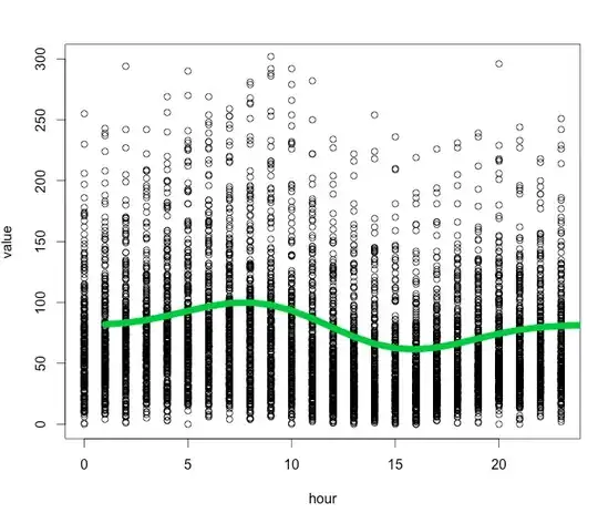
Here is the plot:
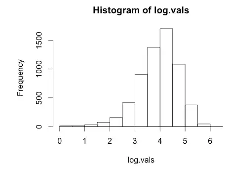
Histogram of log(value)
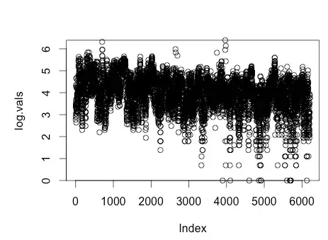
Plot of log(value)
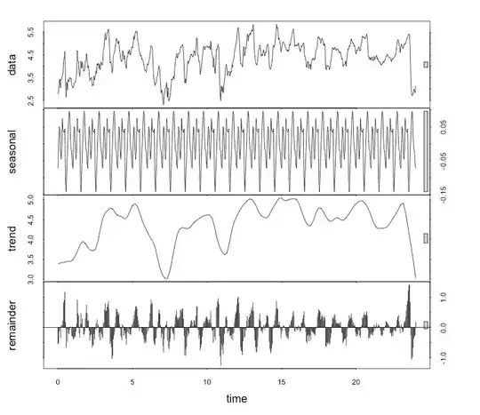
As a time series