5

Context

Environmental data (e.g., pollutant concentrations in water, soil, air) are often lognormally distributed. Even when they are not, we tend to assume that they are (for better or worse).

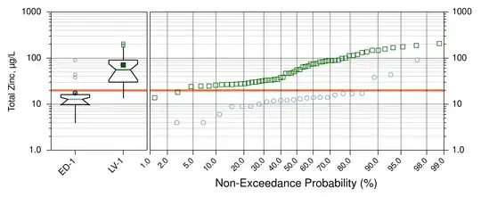
Because of this, 99.5% of the time that I create boxplots, they are presented with a log-scaled concentration axis. Here's an example:

enter image description here

It occurs to me that computing the lower fence as $Q_1 - (1.5 \times \mathrm{IQR})$ may not be the best way when the data are presumed to be lognormal.

(Restated) Question

Given that, for me, the main value of defining the fences as with $1.5 \times \mathrm{IQR}$ is detecting potential outliers, should I define those fences and outliers in log-space, or keep everything in arithmetic space?

I'm currently leaning towards log-transforming the data, but have concerns that this may cause undue confusion or even not be an acceptable practice.

Similar questions

The accepted answer to this question: Is there a boxplot variant for Poisson distributed data? suggests simply transforming the data -- in that case by taking the square root. I'm specifically curious if the fences should be computed in log-space and then converted back to arithmetic space.

Paul H
  • 151
  • 6
  • 2
    I believe you refer to my answer, but you do not quite correctly characterize it. It suggests *re-expressing* the data and redrawing the boxplot based on the re-expressed data. That means that you write down the *logarithms* of the data and proceed with the usual computations *based on the logs*. Although the medians and hinges will be the logs of the original medians and hinges, the step (which determines the fences) will change. That is different than merely drawing the original boxplot on a logarithmic scale. – whuber Aug 21 '14 at 01:05
  • @whuber understood. I'll amend my question accordingly. – Paul H Aug 21 '14 at 01:08
  • What difference would the back-conversion make? Either you will compare the re-expressed data to the fences based on them or you will compare the original data to the back-converted fences. Either way--because any re-expression (such as the root or the log) is always monotonic--the results will be identical. – whuber Aug 21 '14 at 01:46
  • 1
    @whuber I my only concern is that if I log-transform the data and plot those results, I'll label the y-axis "log of Zinc concentrations" and it'll be absolutely clear what's going on. But if I compute the boxplot values on the logs of the data, and then transform back, the figure could need some heavy caveats to adequately convey the whole process. I'm not sure how even a fairly sophisticated audience would feel about that. Would it open the analysis up to criticism? Is it just so unconventional that it'll detract from the analysis? – Paul H Aug 21 '14 at 04:32
  • 1
    You show all the data (good idea), so the box plots on your display only act to provide summaries. Drawing whiskers based on 1.5 IQR has minimal extra diagnostic value given all the detail in the tails. For these and other reasons I favour drawing whiskers to selected quantiles (e.g. 1% and 99%). That is easy to explain and marches well with monotonic transforms. Of course, you should always explain what you do. Conversely, it is striking how many researchers use just one of several conventions in preparing box plots, but don't explain which in their reports. – Nick Cox Aug 21 '14 at 08:39
  • @Nick Drawing the whiskers to predefined quantiles ruins one of the most useful features of a boxplot, which is the automatic presentation of potentially outlying values in an extremely robust way (the breakdown point is 25% instead of 1%). – whuber Aug 21 '14 at 13:37
  • @whuber I am fine with scanning for potential outliers. If given nothing but a box plot, I find that a whisker rule does help flag dubious points. But the quantile plot serves that role better, in my view. The graph above is a superb illustration, in which the detail of the entire dataset gives fuller signals about what to worry about and what not to worry a bit about. I also worry that the box plot serves naive users poorly, as they often won't look at anything else. My recommendation is in this context: that you look at the whole distribution too. – Nick Cox Aug 21 '14 at 14:18
  • @Nick I agree with you when there are a small number of boxplots involved. They become powerful tools when used as side-by-side boxplots or in (larger) "small multiples," when it is either impossible or graphically confusing to display the entire distribution. That is when care in their construction is rewarded. For more about this see http://stats.stackexchange.com/questions/13875 . – whuber Aug 21 '14 at 17:00
  • @NickCox I really appreciate the discussion going on here. I've edited the post to restate my question in hopes that it's more "answerable" – Paul H Aug 21 '14 at 17:10
  • @whuber I suspect that our views are much closer than may appear. Thanks for the reference. In your example, however, all labelling of the 70 or so groups has been lost, so (1) it is hard to see how this would be used in practice (to get an idea of which groups deserve more attention) (2) my advice would be to look at fewer plots at a time. – Nick Cox Aug 21 '14 at 17:11
  • A paper on box plots in Stata at http://www.stata-journal.com/sjpdf.html?articlenum=gr0039 gives some comments on varieties of box plots. The Stata content can be skimmed or skipped by those not interested. – Nick Cox Aug 21 '14 at 17:13
  • 2
    The specific question here is: should be the 1.5 IQR rule be applied on the original scale or on a transformed scale? As @whuber comments, you should apply that rule on the scale used to draw the box plots. If a transformation seems natural or appropriate, calculations should be on that scale. Above all, don't mix scales (e.g. calculate whiskers based on 1.5 IQR on the raw scale, then log transform to get a new graph). – Nick Cox Aug 21 '14 at 17:17
  • @Nick There are (at least) two major uses of side-by-side boxplots. One is to display data summaries, in which case the labeling is essential. Another is in data exploration, in which case more information is obtained by ordering the boxplots either according to a second variable or according to some summary of each boxplot, such as its median or step. Among others, Bertin (*Semiology...*), Tufte (*Visual Display...*), and Tukey (*EDA*) point this out and provide nice examples. In many such cases, showing the entire distribution is either not possible or could be distracting. – whuber Aug 21 '14 at 18:44
  • @whuber No dispute from me on the major principles. But for your examples at http://stats.stackexchange.com/questions/13875/boxplot-for-several-distributions it seems that exploration is seriously inhibited without labelling of the groups. I doubt that you **advocate** that; whether it is a necessary sacrifice given lack of space is a different point. I didn't know that Bertin discussed box plots, unless your reference here is that he discussed ordering of plots within displays. – Nick Cox Aug 21 '14 at 19:22
  • I agree with you @Nick, but illustrating the use of boxplots for exploration was never the intent of that post: it was created to illustrate a redesign of the boxplot. The graphic is there to help people evaluate the readability of the redesign, not to explore data. In fact, far from being any "sacrifice," I actively eliminated the labeling axis altogether in order not to distract readers from this main point. You are correct that Bertin did not discuss boxplots *per se*, but his discussion of ordering of charts applies directly to boxplots. – whuber Aug 21 '14 at 19:36

0 Answers0