3

I always found the concept of determining the "ideal" number of components/factors for an ICA/PCA/FA via a scree plot useful and quick, but also a bit shaky.

In an effort to try to make the scree plot "elbow" more obvious (and without trying to fit a function to the scree plot data points). I was thinking whether plotting on log-scale coordinates might help shed some light.

enter image description here

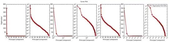
The non-log plot (first from the left) is pretty bunched up, but it's as "obvious" as it gets with scree plots that the third factor is the elbow (and thus my ideal number of factors should be 3).

Now, it also seems that whether my log scale is in base 2 or 10 makes little difference for the plot appearance - which I guess is good.

Lastly, I find that the X/Y log plots show the most quaintness for the 3rd factor, making it the point where 2 types of "curves" in the plot meet. I also think this feature stands out better here than in the first (linear) plot.

Is it safe to assume this is always the case? Is it worth recommending to use X/Y log coordinates for scree plots?

amoeba
  • 93,463
  • 28
  • 275
  • 317
TheChymera
  • 754
  • 2
  • 10
  • 24
  • 1
    For your information: there exist _two_ expositions of the Cattell scree-plot rule: If the "elbow" is the m-th eigenvalue, (1) choose to extract m components; or (2) choose to extract m-1 components. Nobody knows which's better - because the whole rule is so much heuristic. – ttnphns Aug 08 '14 at 02:17
  • 1
    The core idea is a logical one: noise components, because they are noise, should have variances decreasing approximately linearly (while signal components may decrease their variances at any rate). To detect it, one shouldn't transform the plot. At least, I don't see any particular good of it. But - as you wish... – ttnphns Aug 08 '14 at 02:25
  • That helped a lot, actually. So, I guess the answers are No/No, but having said that, and given the info about noise component eigenvalues correlating linearly, would it make sense to do a bivariate outlier test and say all outlier components are important? Or is that just too accurate for a test with a questionable accuracy? – TheChymera Aug 08 '14 at 03:45
  • 2
    @ttnphns: Why do you think that the variance of noise components should decrease linearly? In fact, [I analyzed it once](http://stats.stackexchange.com/questions/87032/eigenvalues-of-correlation-matrices-exhibit-exponential-decay/87146#87146) and it's more of a power-law decay in the middle (and quite messy overall). – amoeba Aug 08 '14 at 07:37
  • 1
    @amoeba, you may be right. I missed that your answer somehow. I'll check it myself, simulating. Anyway, I believe Cattell didn't do statistical probes for that. Note also that often people don't plot scree for all the many eigenvalues, this way they might observe only the linear part of the noise curve. – ttnphns Aug 08 '14 at 08:05
  • @ttnphns: Interestingly, though, on the plot presented here the noise trend looks more exponential than power (it looks most linear in log-y coordinates, not in log-log). Which makes me wonder if I missed something important in my answer linked above (after rereading it now, I guess that approximation in the last paragraphs there can be improved)... By the way, TheChymera, would you mind mentioning what sort of data were you analyzing here? – amoeba Aug 08 '14 at 09:04
  • 1
    This is questionnaire design data with as many questions as you see eigenvalues. So, @amoeba, what do you think about my log plotting? is there any other way to improve scree plot "obviousness" (like with outlier testing) or should I forget about it and use some other method (like Horn's Parallel Analysis)? – TheChymera Aug 08 '14 at 17:40
  • I would reduce the range of the x-axis - what happens if you only plot the first 10, does that make it clearer? – Jeremy Miles Sep 10 '14 at 21:24
  • By the way, @TheChymera, is scree plot ever used for ICA, as your question implies? I thought ICA gives un-ordered components and there is no natural way to order them by variance. Do you have an example of a text using scree plot for ICA? – amoeba Sep 10 '14 at 21:58
  • @amoeba - i thought it could also be used for ICA; are you really sure it cannot? I personally only used it for FA. – TheChymera Sep 10 '14 at 22:01
  • Well, I am only sure that I never saw it used with ICA. Maybe there is a way to use it, and that is why I am curious to see an example. It is usually claimed that ICA returns standardized components and there is *no meaningful way* to assign variance to them and sort them by variance. I never really understood this claim and am actually skeptical about it, but it is definitely repeated in multiple textbooks and papers. – amoeba Sep 10 '14 at 22:11
  • A question about the [Cattell's scree-plot criterion](https://stats.stackexchange.com/q/513911/3277) – ttnphns Mar 17 '21 at 18:22

1 Answers1

1

Summary: I think that converting y-axis to log scale often works the best, in your example as well.

Continuing what has already been said in the comments above: The main idea of looking at the spectrum (also known as scree plot, but I am not used to factor analysis and am not a big fan of its terminology) to identify the number of significant components, is to see how many eigenvalues "stand out" of the "bulk". Therefore, for example, looking at your first plot, I would definitely conclude that the answer is two, and not three.

Does it make sense to transform the spectrum in any way? I would say yes, but only if it helps achieving the above goal, i.e. makes it more obvious which eigenvalues stand out. The first (untransformed) plot is suboptimal, because one simply cannot see anything starting with the third eigenvalue, so there is definitely room for improvement.

Looking at your plots, I would say that transforming eigenvalues (y-axis) to log scale works the best, and in particular better than the log-log plot, mainly because the "bulk" of the spectrum becomes nicely linear, and makes it easy to see how many eigenvalues are strongly above this linear trend (answer: two definitely, but maybe three).

Interestingly, linear trend on a log-plot corresponds to exponential decay, and this is something I have observed myself in many different datasets. The reason for this is not entirely clear to me; please check my answer in Eigenvalues of correlation matrices exhibit exponential decay -- there is an expression for the spectrum of a random covariance matrix, but it is not given by an exponential and I am not exactly sure why exponential function gives such a good approximation. Still, it seems to be the case.

amoeba
  • 93,463
  • 28
  • 275
  • 317
  • many thanks for the answer, however, I cannot agree that the y-log plot makes anything more obvious. You say it shows a log-linear decay for the noise components - which is true for the middle of the noise spectrum. Around the elusive elbow, though, it shows some weird curving up making it non-obvious for me where in the (1,15] interval the elbow is supposed to be... – TheChymera Aug 08 '14 at 22:30
  • @TheChymera: Well, it is obviously a matter of judgment, and I have provided mine. If you want a more "objective" criterion, do Monte Carlo permutation test (aka parallel analysis), or cross-validation, or anything like that. Having said that, 1 to 15, really? Come on, it is either 2 or 3, the rest just blends together completely. – amoeba Aug 08 '14 at 23:06
  • that's true (that everything else blends together) - but am I not supposed to be looking for an elbow? Or should I only be looking at the distanced between the points in the log plot? – TheChymera Aug 08 '14 at 23:25
  • @TheChymera: But what *is* an elbow? For me, the telling sign of noise components is precisely that they blend together; the shape of the noise spectrum is not very clear (Cattell, who [coined the term "scree plot"](http://scholar.google.pt/scholar?hl=en&q=cattell+scree+plot)) wrote about linear decay, hence "scree"; to me it looks rather exponential; but as you point out, not exactly so; so it's complicated and might depend on the data as well), so defining the elbow via the shape of the spectrum does not seem right. I suggest looking for components that stand out from the rest. – amoeba Aug 09 '14 at 08:54
  • Have you thought about (self-)publishing that noise study of yours you linked to? perhaps also adding some real data set examples or using some other noise functions except gaussian? I might be interested in citing it in the future. – TheChymera Aug 10 '14 at 20:52
  • 1
    @TheChymera: To tell the truth, this idea never crossed my mind. I agree that it could be a curious investigation (if it does both: analyzes a lot of real data sets from different fields, and presents some extensive modeling), but I don't think I am going to have time for this... I might think about it though. If you get any further ideas about your spectra, let me know, I am curious what you will settle on. Hope our exchange was useful for you. – amoeba Aug 10 '14 at 21:52