I had a recent question which I probably should re-formulate to a more general one.
I came across this: Using scatter plots to understand multiple values of Y for a given X and thought the accepted answer was very good, but what's unclear to me is: given a nasty scatter plot, how would you visually get the idea what sort of relationship the x:es and y:s have? In my mind, there's no way of telling if a linear, quadratic, etc regression is appropriate.
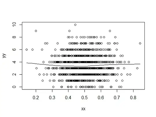
If we look at the plot that is currently confounding me:
My idea was to somehow plot the AVERAGE of f(x), with x clumped together in intervals, instead of each observation. Is this how you would go about it? If not, what other way do you visually make sense of this data?