Will a graph on predicted and measured values plotted for two models separately be helpful in comparing them?
Asked
Active
Viewed 186 times
2
-
2A better approach would be to calculate the **residuals** (i.e. `e = actual - predicted`) and then plot those on the y-axis and the **predictor** on the x-axis. – Steve S Jul 25 '14 at 01:32
1 Answers
3
Yes, by all means, visualize your data whenever there's the slightest excuse. I even do it when I'm asked not to! Here's an example from a hobby analysis of mine using logistic regression. Compare:
glm(y~scale(x),family=binomial(link=probit))                   #First-order model vs.
glm(y~I(scale(x)^2)*I(scale(x)^3),family=binomial(link=probit) #Interacting polynomial model
                                                               #Plotting code in R follows:
require(ggplot2);ggplot(mmath,aes(x=scale(TapologyOddsSharkAOdds),y=AWinBLose))+
geom_point(position=position_jitter(width=0,height=.04))+geom_smooth(lty=2,col='black',se=F
)+stat_smooth(method=glm,family=binomial(link=probit),col='red')+
stat_smooth(formula=y~I(x^2)*I(x^3),method=glm,family=binomial(link=probit))+
scale_y_continuous('Probit regression prediction of probability that Contestant A would win'
,lim=0:1)+scale_x_continuous('Prior odds that Contestant A will win (scaled)')
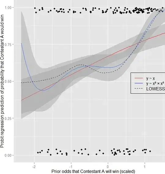
Forgive the busy chart, but I think this tells the comparative story best so far. It's a probit regression model of contest outcomes based on odds estimated by expert judges. The red one is the simple model, the blue one is a wacky interacting polynomial model, and the dotted black line is a LOWESS line, which I generally like to add to my plots to see what something sort of nonlinear and overfitted would look like. I don't take the LOWESS model very seriously otherwise, largely because I honestly don't understand it, but also because its bumps are basically atheoretical and exploratory.
The simple linear model makes sense, and works reasonably well. Its AIC = 382.28.
Coefficients:          Estimate Std. Error z value Pr(>|z|)
(Intercept)             -0.3690     0.1932  -1.910   0.0562 .
x                        1.3284     0.3023   4.394 1.11e-05 ***
Null deviance: 397.73 on 310 degrees of freedom; Residual deviance: 378.28 on 309 df
The polynomial model doesn't make as much sense, but seems to fit even better..? Its AIC = 374.48.
Coefficients: Estimate Std. Error z value Pr(>|z|)
(Intercept)    0.23423    0.11937   1.962  0.04974 *
I(x^2)         0.33684    0.13540   2.488  0.01286 *
I(x^3)         0.45981    0.09743   4.719 2.37e-06 ***
I(x^2):I(x^3) -0.06350    0.02291  -2.772  0.00557 **
Null deviance: 397.73 on 310 degrees of freedom; Residual deviance: 366.48 on 307 df
However, there are a number of reasons not to trust the polynomial model. Most of them are tangential (not sure if it's OK to exclude the first-order term, hard to justify all the wiggles theoretically, purely exploratory, etc.), but one particular problem I'm not comfortable with is that big upward jump at the far left end. A prior odds estimate of x=.99 could be reexpressed as x=.01 if I swap my designations of "Contestant A" and "Contestant B", which are assigned arbitrarily. In my dataset, max(x)= .99, but max(y) = .03. An x=.01 corresponds to a $Z(x)=-2.36$, which is in the danger zone of inflated predictions and probably a very large residual, because that contestant would almost certainly lose (y = 0) – note that y = 1 (indicating victory) invariably for $Z(x)\ge1.25$.
The punchline: I wouldn't have realized that the model has that big, inappropriate upturn for extremely low odds if I hadn't plotted it. It might be making better predictions for me so far, as it does follow the LOWESS line much better and seems to recognize the near-certainty of victory when x is very high...but if I ever get a very low x outside the training sample, I can expect a silly prediction, which is good to know in advance. Furthermore, this is evidence that I need to ask some questions of my own regarding this polynomial model and how I'm assigning Contestant A status...In any case I ♥ ggplot!
Nick Stauner
- 11,558
- 5
- 47
- 105
-
1+1 a good answer, but I just want to point out that a LOWESS/LOESS type smooth isn't *necessarily* overfitted (it might be in this case, but I am not sure it is) -- it has a smoothing parameter, and it's perfectly possible for it to underfit (to smooth too much, failing to follow 'real wiggles' in the data). It - and local regression type methods more generally - is a very useful tool in a wide variety of situations. It's not so hard to come to grips with local regression methods, there might be a good question to be had on how LOWESS works... – Glen_b Jul 25 '14 at 01:57
-
1It's also possible for it to overfit in one part (smooth too little, picking up noise) and underfit in another (smooth too much, having noticeable bias) – Glen_b Jul 25 '14 at 02:00
-
1True; I just assume it's overfitted because I can't explain it, but I know that's not really what overfitting is about, and I appreciate the possibilities of underfitting and real wiggles. Same issue regarding understanding it – I don't expect the math to be entirely baffling, and the predictions are plenty straightforward interpretively, but trying to fathom the theoretical justification for those real(?) wiggles is a little intimidating, especially when modeling something I don't understand on a very concrete level nor have thousands of data to describe. – Nick Stauner Jul 25 '14 at 02:24
-
1Looking at the data points for the x-variable between about -1.5 and 0.5, it at least looks like the local fit near -0.5 would have negative slope. Chasing through the documentation, it seems like it must call `stats::loess`, which (if it's using the defaults for that implementation) will actually fit local quadratic with a span of 0.75. That span seems like it might tend to smooth most of that out, but the fact that the kernel is only high in the middle of the window lets it come through. In any case, looking at the data it doesn't surprise me much that it looks as it does. – Glen_b Jul 25 '14 at 03:38
-
1On the topic of the question, I suppose that's another good point about plotting: get the data scattered in there too! Makes the model comparisons much clearer. On our tangent, I agree, the local regression doesn't look too bad, and this is primarily a prediction enterprise, so I don't *really* need to know what's going on as long as it works, but I have trouble believing the little wavy section in the middle isn't just sampling error obscuring a simpler relationship. Same concerns about the polynomial model of course, and to be fair to it, the confidence band is huge on the left side... – Nick Stauner Jul 25 '14 at 05:05
-
1Yes. I imagine a monotonic fit - such as a monotonic spline would describe it quite well. – Glen_b Jul 25 '14 at 05:23