7

I'm looking for a visually compelling yet immediately understandable way to visualize a range of data (min, median, max)

Considerations:

  1. The approach should be understandable to a wide variety of people
  2. Ideally, would allow for the comparison to another set of data
  3. Ideally, will work okay or both high and low N cases

What new ways can you think of to visualize this type of data?

Here are some examples:

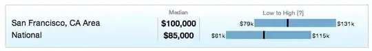
Example 1: Here is how a range of data and a comparison is displayed on Glassdoor:

visualization of a salary range on Glassdoor

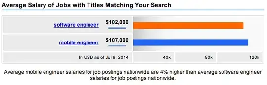
Example 2: Here is how a range of data and a comparison is displayed on Indeed:

visualization of a salary range on Indeed.com

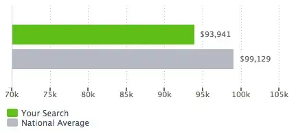
Example 3: Here is another very similar example from CareerBuilder:

enter image description here

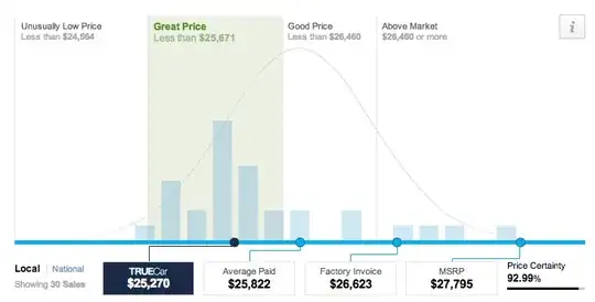
Example 4: and Trucar's visualization of a range of data (car prices paid by many users).
This is likely pushing the realm of understandability by an average audience.

visualization of car price distribution on Trucar

Ferdi
  • 4,882
  • 7
  • 42
  • 62
user49598
  • 71
  • 1
  • 3
  • 5
    one vote for the glassdoor style – Aaron Jul 06 '14 at 22:01
  • 1
    The first one is the only one of the three that clearly identifies the three values you mentioned. You might consider a boxplot-without-the-box. – Glen_b Jul 06 '14 at 22:27
  • 1
    It is curious that neither examples 2 nor 3 actually show ranges in the usual sense of the word. That raises the question of what you understand a "range" to be. Does it differ from the conventional meaning of the interval from the least to the greatest value of a set of numbers? – whuber Jul 06 '14 at 22:27
  • 1
    By a boxplot-without-the-box I meant something like [this](http://i.imgur.com/wo78O1z.png); this is easy to generate in R. – Glen_b Jul 06 '14 at 22:38
  • 1
    [Here](http://stats.stackexchange.com/questions/64880/software-to-produce-confidence-interval-error-bars-from-summary-statistics-witho/64889#64889) is one script in R you could adapt to generate @Glen_b's suggestion. – Andre Silva Jul 06 '14 at 22:40
  • 2
    @whuber, no, my understanding of a range does not differ from what you'd expect. These just happen to be the only examples I can easily find online that are close (and, are from large consumer web sites). – user49598 Jul 06 '14 at 22:51
  • Can any of you think of any other large consumer web sites that might be displaying similar information using a different visual approach? – user49598 Jul 06 '14 at 22:54
  • 1
    @AndreSilva That's nice. I just called boxplot with the median replicated two additional times, plus the min and max, then set `range=0`. – Glen_b Jul 06 '14 at 23:19
  • What tasks do you need a viewer to be able to do? And, what is the metric? Speed? Accuracy? –  Jul 07 '14 at 01:49

1 Answers1

2

Example number 1 seems to be nice if you have different minimum thresholds among the categories.

As pointed by Glen_b and whuber, it seems that examples number 2 and number 3 do not show the ranges of your categories, but just one unique statistic (it could be the median, or the maximum values) at the top of the horizontal bars.

The example number 4 is a little bit strange because the bell curve does not represent the distribution of the bars (for example, the blue light dot 'average paid' is the average of the bell curve, not the average of quantities shown in the bars). It is not "visually compelling yet immediately understandable" to me.

As you asked for another option, I would suggest the boxplot, which shows:

  • outliers (the dots),
  • minimum and maximum values without considering outliers (the end of the whiskers)1,
  • first and third quartiles (the edges of the box), and
  • median (the horizontal bar inside the box).

Each box is a category. Order the boxes from left to right starting with the category with greatest median.

The example number 1 is simpler to understand, so it will depend if a boxplot will really help.

1: see whuber's comment for clarification.

Andre Silva
  • 3,070
  • 5
  • 28
  • 55
  • 3
    +1 But please note that boxplot whiskers conventionally--and by original design--do *not* necessarily extend to the extrema. They stop at the most extreme *non-outlying* data. Outliers--defined as those beyond invisible "fences" determined by the medians and quartiles (or "hinges")--are depicted separately with point-like symbols. In my experience, too, boxplots take a lot of explaining to people who are not educated in their use. That would be most older people and probably a lot of middle-aged ones, too. – whuber Jul 06 '14 at 22:56